
What is Electra?
Looking for a typeface that suits your application functionally and aesthetically may feel like a daunting task when you are still developing your typographic skills.
If you are a graphic design student struggling to find the next typeface to use for your print project, the transitional serif Electra may be the end to your troubles. In this post, I’ll define Electra, its characteristics, and what it is used for today so that you feel confident adding this typeface to your design toolbox.
Source: http://www.identifont.com/show?LI7
Electra Bold Display
What is Electra?
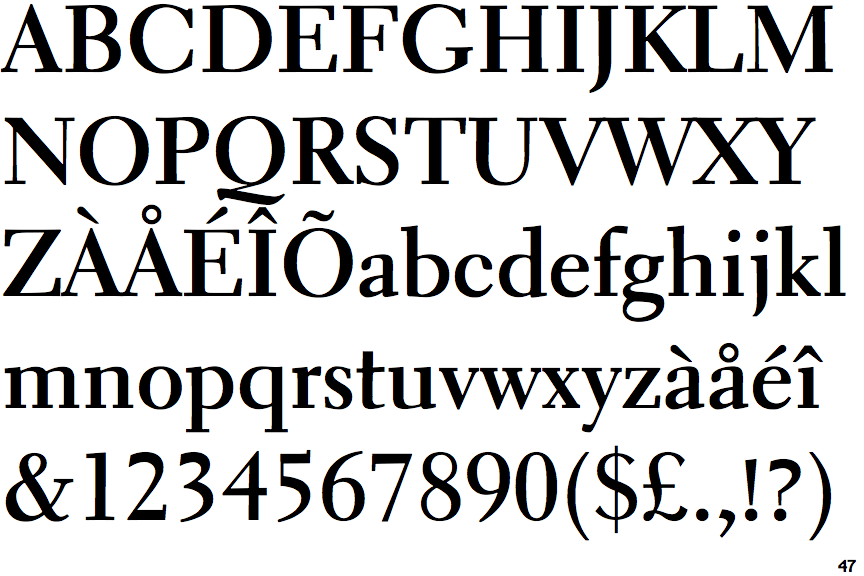
Electra is a 1935 transitional serif typeface designed by William Addison Dwiggins.
When creating Electra, Dwiggins avoided characteristics of Renaissance Revival fonts. This led to the creation of a modern, yet classic book typeface full of personality.
Characteristics of electra
Electra originally caught my eye because of its flat curves in some letterforms such as the ascender in lowercase ‘f’ and the terminal of lowercase ‘a’. Further examination of the font revealed more quirks such as rounded serif endings, square serif endings, thicker top than bottom serifs, and slanted cross bars such as in lowercase ‘t’.
Jim Parkinson took note of these defining characteristics during his process of designing Aluminia, a typeface inspired by the original drawings of Electra.
Some serifs have round endings, but most of the serifs were drawn with square endings. Some serifs were thicker than most – again deliberate. Some corners were bracketed. Some were not. Every once in a while, it seems a letter wants a little freedom and a character is graced with an unexpected curvy stroke. And the crotches (inside angles) of the caps like A, M, N, V, W, X, Y, and Z are not sharp. [...] They are rounded off (very carefully with a 9H pencil) which, together with a bunch of similar moves, gives the design a sensitive, soft, handmade feeling.
Jim Parkinson “Recasting Electra as Aluminia”
It was interesting to me how Dwiggins could create a typeface with so much warmth and still maintain a modern, timeless feel. The squareness of the typeface provides extra definition of some letterforms, making its readability great at small point sizes. Though originally intended for long pieces of text, Electra is just as beautiful and legible when blown up for display.
Why is Electra important?
A design student could find so much inspiration from learning about the process behind Electra’s creation. Dwiggins stated his goal, “I’d like to make a type that fitted 1935 all right enough, but I’d like to make it warm - so full of blood and personality that it would jump at you,” (Dwiggins). Dwiggins’ embrace of the machine-age and rejection of revivalist Renaissance fonts resulted in an inventive typeface. Electra is a testimony to the success that can come from steering away from trends of the time and using the world around you to create something new.

Electra Today
Source: http://www.etsy.com
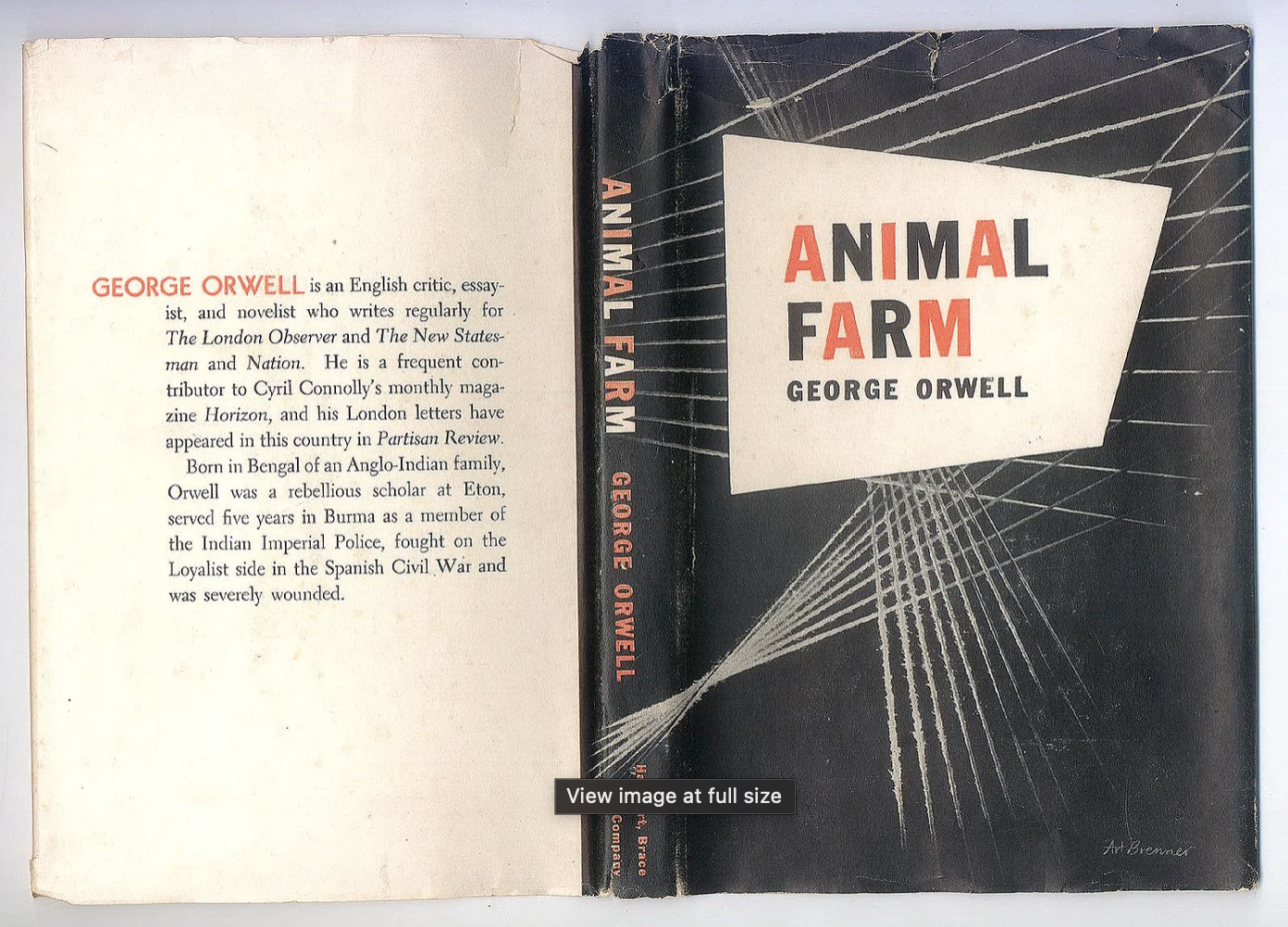
Fonts In Use highlights Electra’s use in many book designs.
To name a few, Electra is used to set the body text in Terra Foundation Essays Series, Electric Eden: Unearthing Britain’s Visionary Music, The Book of Wonderful Characters, American Tableaux Booklets, and Animal Farm. In one instance, Electra is used in Ted Cruz’s 2016 presidential campaign as a logotype.
While historically Electra has been used for book design, it is quite possible for today’s designers to reinvent its function and apply it to new formats and ideas. Its classic design allows it to stand strong against other renown print typefaces such as Baskerville and Caledonia. However, its surprisingly sharp, energetic characteristics partnered with its unexpected curves separates the typeface from its competitors. Electra gives content a voice that is sophisticated, yet warm and full of life.